Figma Prototypes
Current State Evaluation
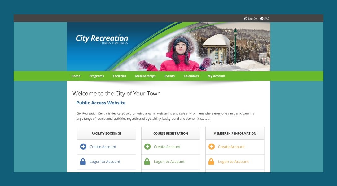
The website for Univerus Sport & Recreation's Public Access Website suffers from a number of usability issues, including the lack of upfront information, confusing account types, poor visibility of important features, accessibility issues, and confusing recurrence options. Additionally, the site is outdated and difficult to use and navigate, which may compound the existing problems and make it even more challenging for users to complete tasks and find the information they need. To address these issues, it's important to update the design and functionality of the website to meet modern usability standards and improve the user experience.
Research
To begin with, I conducted competitive analysis and audited websites like Intelligenz Solutions, Fusion, Day Smart Recreation, and Pitchbooking. This analysis made me realise that most competitors did not use many images and had outdated visuals. I also discovered some features that these websites used that could help simplify the user process of doing tasks on the website, such as progress bars, breaking up sign-up forms, filter boxes not hidden, using images, and calendar designs.
Competive Benchmarking

During the competitive benchmarking process, I analysed several websites in the same industry to understand how they were designed and what features they used to improve their user experience. This helped me gain valuable insights into the current market trends and user expectations.
this process, I found several useful features that could be incorporated into the Univerus website design. For instance, progress bars can help users keep track of their progress while filling out forms, making the process less overwhelming. I also noticed that breaking up sign-up forms into smaller sections, each with its own header, makes it easier for users to understand the information required.
Online Surveys
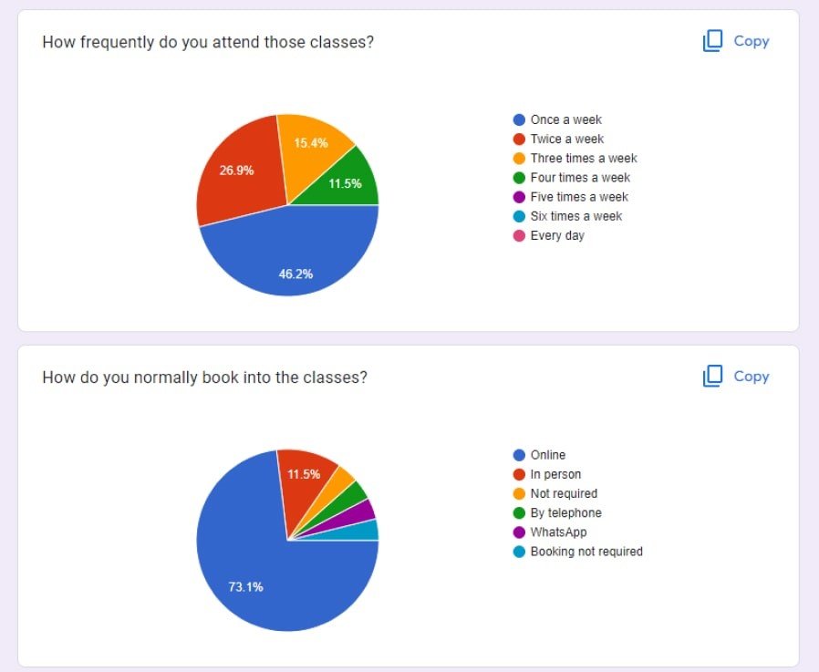
To increase the response rate, I distributed the survey through various channels, including social media platforms, email lists, and online forums. I also made sure to target individuals who were potential users of the Univerus website, such as families who frequently use sports facilities or enrol in courses. The data collected from the survey provided valuable insights into users' expectations, behaviours, and preferences, which were used to inform the design of the website. The survey helped us to identify pain points and common frustrations that users experienced with similar websites. Additionally, the survey allowed us to identify the most important features that users expected from the website, which helped us to prioritize our design decisions.
Usability testing
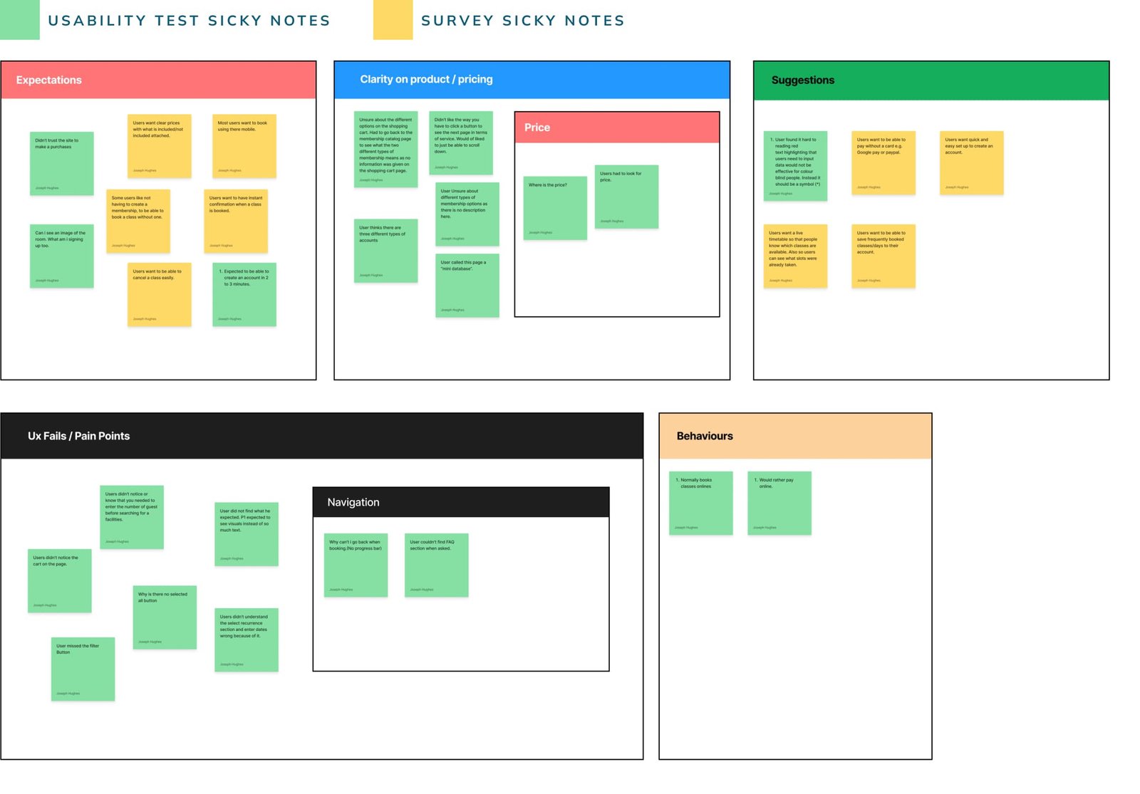
For the usability testing phase, I followed a user-centred design approach to gain qualitative insights into the usability of the old site. I defined clear objectives and carefully crafted testing scripts to avoid leading or closed questions that would be unfruitful. I conducted two rounds of usability testing with different users to ensure diverse feedback.After the testing, I compiled a list of problems and pain points that users encountered, in addition to the feedback from the surveys. To identify the root cause of the issues, I analyzed the results and applied some common UX laws that the site broke. Then, I brainstormed and came up with various solutions to address the identified problems and enhance the user experience.
Analysis
The user data suggests that the Univerus website needs improvement in terms of providing easy access to previously entered information, providing more upfront information about classes, prices and images, using appropriate symbols instead of red text, making the filter button more visible, and being more clear about recurring options. The survey results show that users want a quick and easy account set up, live timetable, ability to save frequently booked classes, instant confirmation when a class is booked.
UX Laws broken
Through usability testing and the affinity diagram process, I was able to identify the UX laws that were broken on the old Universe website. The laws that were broken included
-
Jakob’s law
Unlike many other recreational class booking sites, Univerus does not follow any similar processes making it look different from what the users are used to.
-
Miller’s Law
There is a large amount of text on the Univerus booking page. This makes it difficult for users to follow processes effectively as it is difficult to store that amount of information in their memory at once.
-
Aesthetic usability effect
In terms of visual appeal, Universe doesn't meet the criteria. The website is outdated.
-
Hicks law
Information isn’t broken down into easy-to-read sections for users to understand.
-
Goal-gradient effect
The goal-gradient effect is the principle that as a person gets closer to their goal, the more they speed up to reach it. Universe can use this law by adding a progress bar as a motivator and help use complete necessary steps.
Affinity Diagram
The affinity diagram helped me to identify common themes and patterns that emerged from the user data. I found that users had issues with various aspects of the site such as navigation, pricing, and the booking process. I also identified several pain points from the old site, such as the difficulty in noticing the cart and the lack of clarity on product or price that made users drop off. Additionally, I noted suggestions that users had, such as having a clearer input for guest information, adding tooltips, and making the FAQ section more noticeable.
To prioritize the issues, I assessed their impact on the user experience and identified the ones that were most critical. I found that the lack of clarity on product or price had a significant impact on users and caused them to abandon the site. I also found that issues with navigation, such as the filter button being hard to find, led to frustration and confusion.
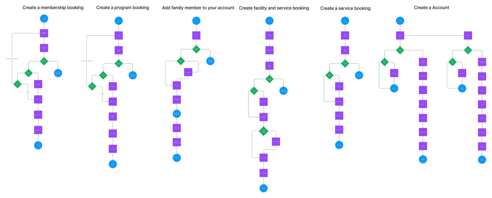
Userflow
Now that I have more idea of the mindset of the user and the problems and pain points they come to face. I started to create user flows. I began to map every step of the user interaction required to achieve the main goal of this website: “ I as a user want to be able to sign up for a course”.
Lo-Fi Wireframes
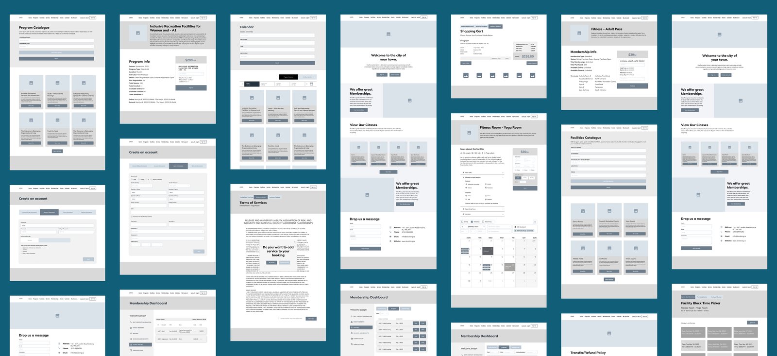
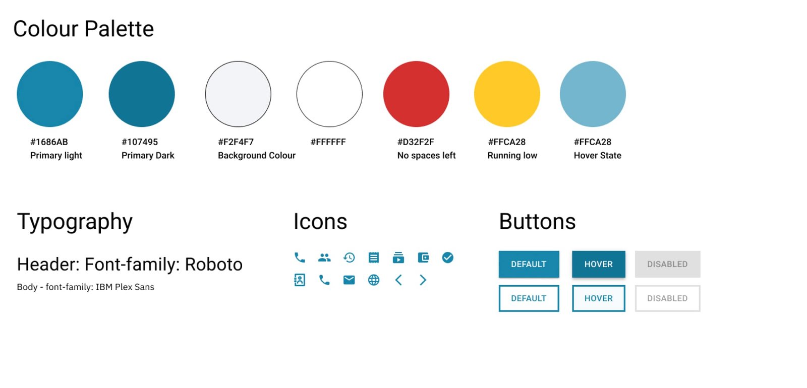
UI Kit
Mobile Design
The Univerus Public Access website initially lacked a mobile version. Given the significant growth of mobile users, it was essential to provide them with an optimal browsing experience. The client explicitly requested a responsive design rather than an adaptive one. This meant I had to conceptualize a design that flowed seamlessly across both desktop and mobile platforms, ensuring that user experience was consistent and intuitive. I began with the desktop design, as I find it more straightforward to reduce or modify elements for mobile, rather than scaling up from a mobile-first design. This approach allowed me to establish a comprehensive layout and then refine it for smaller screens.
Solutions Implemented:
-
Floating Action Button: On the mobile version, I introduced a floating action button as a substitute for the side menu seen on the desktop version. This choice provided mobile users with easy access to core functions without overwhelming the limited screen real estate.
-
Slider Breadcrumb Menus: Recognizing the need for efficient navigation on mobile, I integrated slider breadcrumb menus. These not only maintained the site's hierarchical structure but also offered a touch-friendly navigation system.
The client expressed particular appreciation for the mobile design. Considering the increasing number of users accessing websites via mobile devices, this positive feedback underscored the importance of our efforts to prioritize mobile UX.
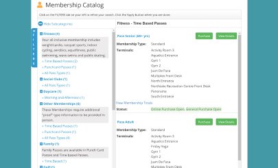
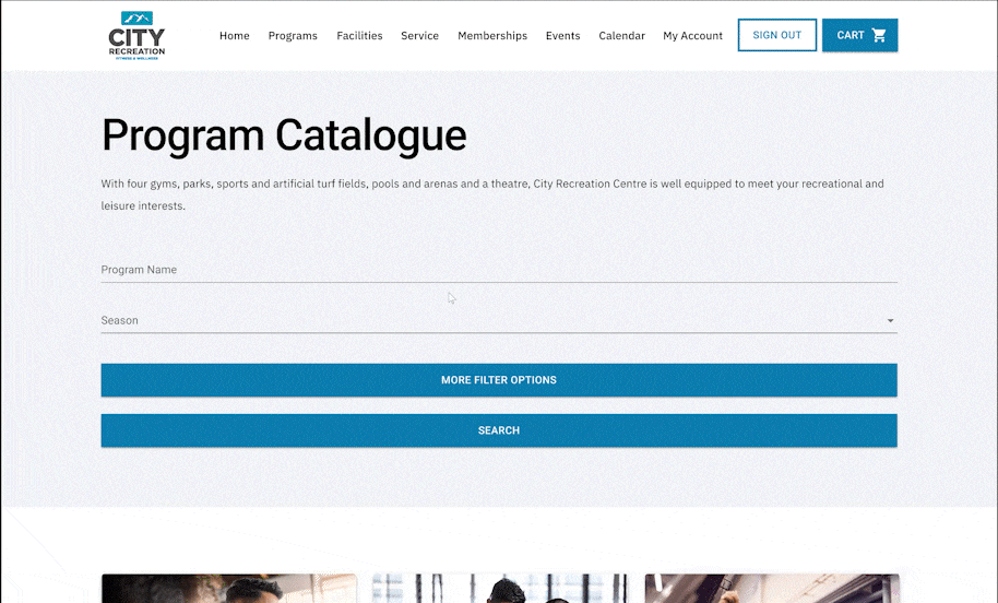
Catalog Problem
Catalog problem was that there where to much information layout on the screen for the user to process at one time so my solution was to break up the information it to bit size chucks. By using subcategory's and cards to layout the information better for the user. Also by adding a timeline so the user can easily tell where there at and can easily go back.
Old Catalog
First iteration
Second iteration
After testing this out by useably testing and showing the clients I found that user would also like to see a list view expely when they use the filter option and the result shows a lot of course the cards can mean a lot of scrolling. So I add the option to switch to list vew for people to have the option.

Summary
After testing this out by useably testing and showing the clients I found that user would also like to see a list view expely when they use the filter option and the result shows a lot of course the cards can mean a lot of scrolling. So I add the option to switch to list vew for people to have the option.
One of the most critical learnings from this case study is the importance of understanding the existing UX standards and norms within an industry. The breaking of several UX laws in the original design was a key factor that contributed to the site's usability issues. By identifying and addressing these, I brought Univerus's user experience more in line with user expectations and industry best practices.
The transition from a desktop-focused design to incorporating an optimized mobile experience was another significant leap forward. In today's digital age, with an increasing number of users accessing web services on mobile devices, offering a seamless and intuitive mobile user experience isn't just a 'good-to-have' – it's imperative.
The redesigned catalog, broken down into bite-sized chunks of information and enhanced with options like card and list views, showcases the importance of flexible and adaptable designs. It's a testament to the necessity of iterative design processes. By continuously seeking feedback and making informed adjustments, were able to develop a more user-friendly interface that caters to diverse user preferences.
In conclusion, the journey of redesigning the Univerus website has been a holistic learning experience, highlighting the significance of deep user understanding, adherence to UX laws, and the importance of flexibility in design. The end result is a website that not only meets but exceeds modern usability standards, ensuring that families can effortlessly manage their accounts, make bookings, and access all the features Univerus has to offer.