The client, a formwork company that provides renting and leasing of construction and civil engineering machinery and equipment, came to us with a briefing to create an updated logo and website to suit their company rebrand.
After interviewing the client we created character personas to develop a target customer. We then created style scapes around two potential customers and allowed the client to choose which suited them best.
We first interview the client to find out about their company and for them as an exercise to put in words their Purpose, Vision, and Mission as a company. To do this was to ask a lot of questions on how the company was started, what they have to currently offer and the ideal client for them plus a lot more
Is to provide an high standard to there customer supplying them with a quality products, meeting their demands, meeting there timescales. To be honest with the customer and help them out as much as possible. To look after our staff, provide job security, ensure that it’s self-sustaining and people are proud of.
Build relationships with customers old and new. Develop our services by buying new equipment and getting more staff so they can offer more services. Give the customers more of an understanding by marketing the company through a website, brochures and manuals.
We believe in providing our staff with the tools and the knowledge to provide a product that they will be proud to see in years to come and say ‘I worked on that project’.
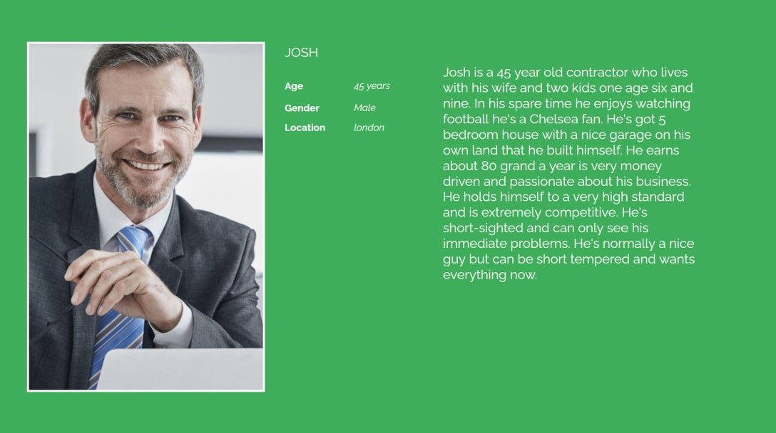
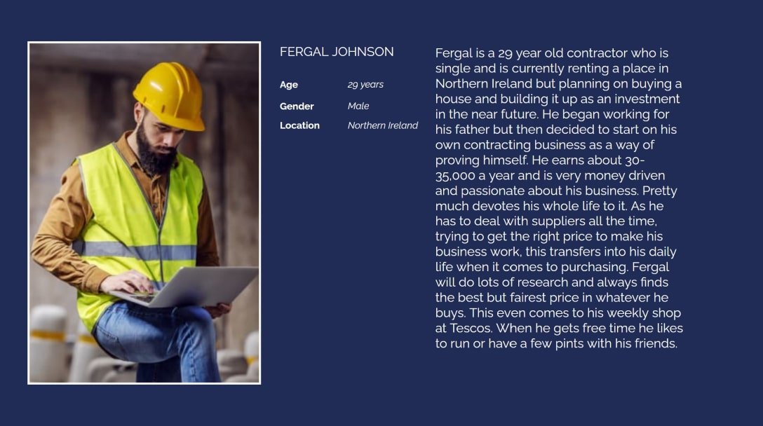
From there we look at creating their brand personality. To do this we need to describe the brand as a person. We created two brand personas with the client as they know their customer the best. Next, I create two style scapes for each persona and then present them to the client. The client liked the first style scape more as they liked the more clean look with the straight less curved angles that suited the professional corporate client that they are looking for.
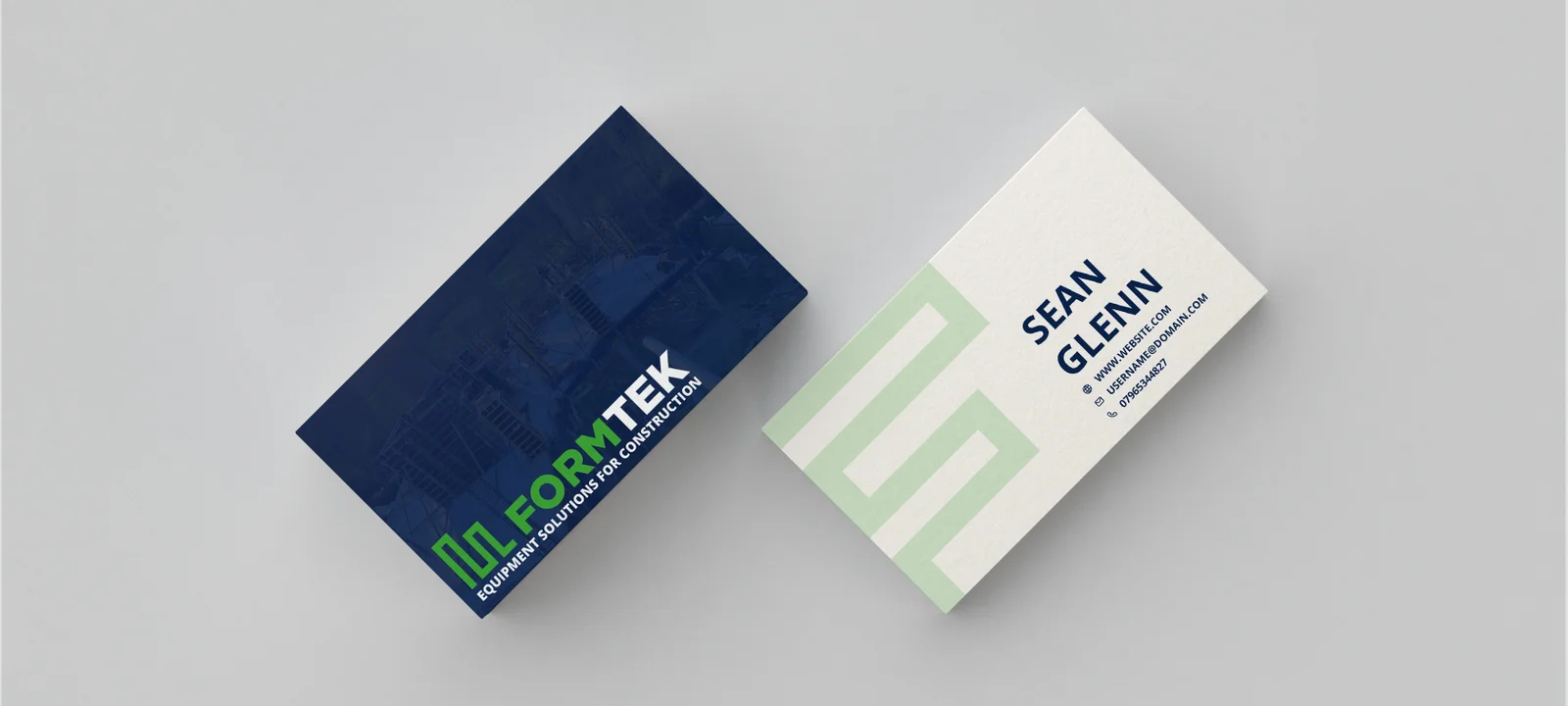
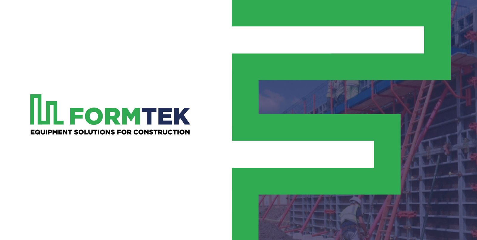
The result was I had created a simple clean logo that the client was happy with. Using the colour scheme I was given, I made a definition between form and tek by making them different colours as a lot of the products they sell are themed with the name. Using construction diagrams of formwork I was able to come out with the idea of the icon you see. The icon represents the two boards where the concrete is poured. Also, the icon I created represents an F in FormTek. The icon makes the logo very versatile as you can use it as a pattern for a background or you could use the icon or just the text depending on the size of the product you're putting it on.